
Creating color paint palettes that work
Creating color paint palettes that work
Color paint palettes and glass paint
In the last post, I discussed monochromatic color paint palettes. Those are color choices that revolve around a single basic hue, but include variations in saturation. For example, a monochromatic color paint palette may use blue as the base color and incorporate lighter or darker shades of blue as accent colors.
Three color paint palettes
Three color paint palettes incorporate three colors that are evenly spaced on the “color wheel.” These colors would be 120° apart. Red, yellow and blue make up a three color paint palette. Red, yellow and blue are all primary colors, so this particular paint palette would be an attention-grabber. You can soften three color paint palettes by choosing one primary color, and using the other two colors as accents. You can also soften three color paint palettes by choosing variations in saturation.
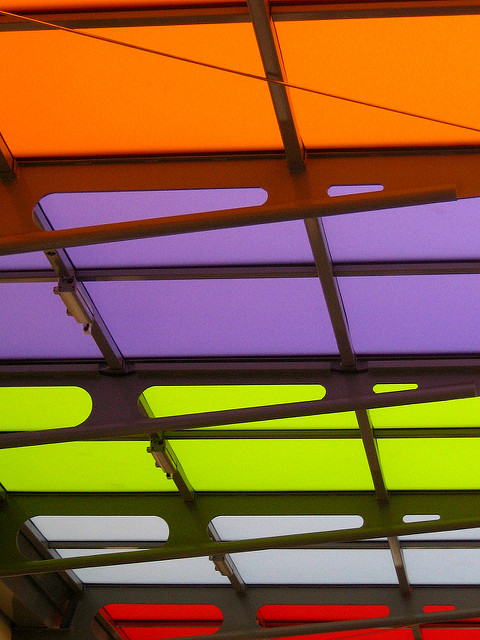
Four color paint palettes
Like three color paint palettes, four color paint palettes incorporate four colors that are evenly spaced on the color wheel. This time, the colors are only 90° apart. Orange, yellow, blue and purple make up a four-color paint palette. Yellow and blue are two primary colors, while orange and purple are two complementary colors. Four color paint palettes may or may not include primary colors. A four color palette could be made up exclusively of complementary colors.
Another approach to choosing four color paint palettes is to choose a color on the color wheel, then choose its complement. For example, choose red and its complement, green. Then choose a color that’s 60° away from red – either yellow-orange or purple – and that color’s complement. You could end up with a palette of red, green, yellow-orange and light blue, or red, green, purple and yellow. Again, using a palette like this, you’d choose a “master” color and use the rest as accents. You could also choose a neutral color as the master color, and use all four colors as accents.
Larger color paint palettes won’t allow you to accomplish more, especially in small spaces. If you’re working with a big space – as in am entire house or a commercial space – you might be able to pull it off. You could also work with different palettes and incorporate some of the same colors in each one.
If you’d like more information about creating color paint palettes, please check out the rest of our site. If you’re ready to shop for glass paint, please visit our online store.
Photo Credit: Sophie et Cie, via Flickr.com

